Seller Platform Application
The Seller Platform App was envisioned as a mobile extension of Fynd’s robust web-based commerce solution — reimagined to fit in your pocket. From onboarding to order management, the platform helps thousands of sellers launch and scale their stores with ease.
My role
A Product Designer, leading form UX strategy to high fidelity UI design.
Timeline
2022-2023
Team Members
PM, engineers, QA, marketing, graphic & motion designer and business operations.
Organisation
FYND (Shopsense Retail Technologies Ltd.)
Highlights
Simplified seller onboarding, reducing setup time by 40%.
Vertical
B2B, B2C, SupplyChain, E-commerce SaaS
Project Overview
The Seller Platform was feature-rich, but its web-only design had become a barrier. Many users found it overwhelming, especially small business owners and on-the-move sales teams who needed fast, simple tools—not a full desktop setup
The company’s OMS had reached a breaking point. As orders scaled, fulfillment complexities grew—fragmented processes, reliance on spreadsheets, inconsistent handoffs, and reactive SLA tracking. I was brought in to redesign the entire system from the ground up.
The Challenge
Create a mobile experience that brings clarity, speed, and role-specific value without losing the power of the original product.
The business recognized this gap. Mobile-first users were growing, yet we had no mobile solution. Sellers struggled with everyday tasks like managing orders, updating storefronts, or checking performance without a laptop. We needed to rethink the platform—not replicate it on mobile, but redesign it to work naturally for people who run their business from their pocket.
User Problem
Sellers struggled with fragmented tools, lack of visibility into performance, and inefficient workflows for managing products, orders, and inventory across platforms.
Business Goals
To streamline seller operations by unifying tools into a single platform, improve seller retention through better usability, and boost GMV by enabling faster catalog and order management.
Impact
Here’s what happened after launch. The numbers, Before we move on
The launch of the Seller Platform App sparked immediate traction among users. Sellers quickly embraced the mobile-first experience, appreciating its simplicity, speed, and flexibility.
2300+
Brands growing with this solution
60%
Existing user adopt to mobile version.
10-15%
Increase in top-line revenue
38%
Reduction in task completion time.
The Research
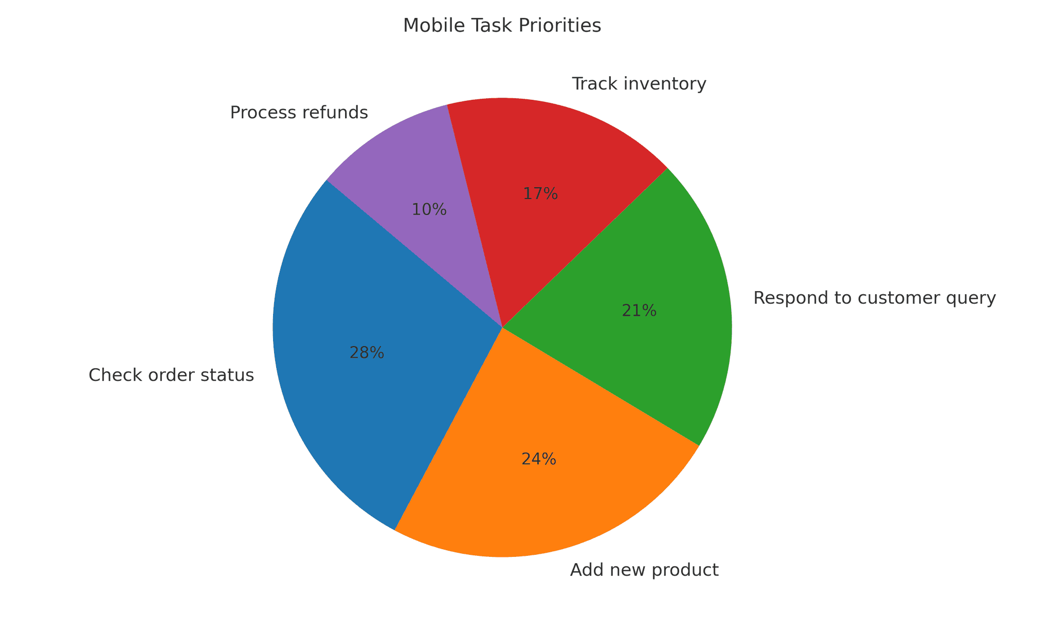
We initiated a user research study, surveying over 500 participants from our existing user base, We needed to deeply understand what different users actually needed in a mobile-first context.
we focused on uncovering three key things: what tasks matter most on mobile, which pain points were holding users back, and how workflows varied by role.
Key Findings:
The web platform was powerful but overwhelming. Many users especially on-field sales teams and small business owners struggled to navigate its complexity. They needed something simpler, faster, and mobile-first.
This research became the compass for everything that followed. It validated our belief that the mobile app had to be more than a downsized web platform. it needed to be reimagined from the ground up, role by role, task by task.

The Process
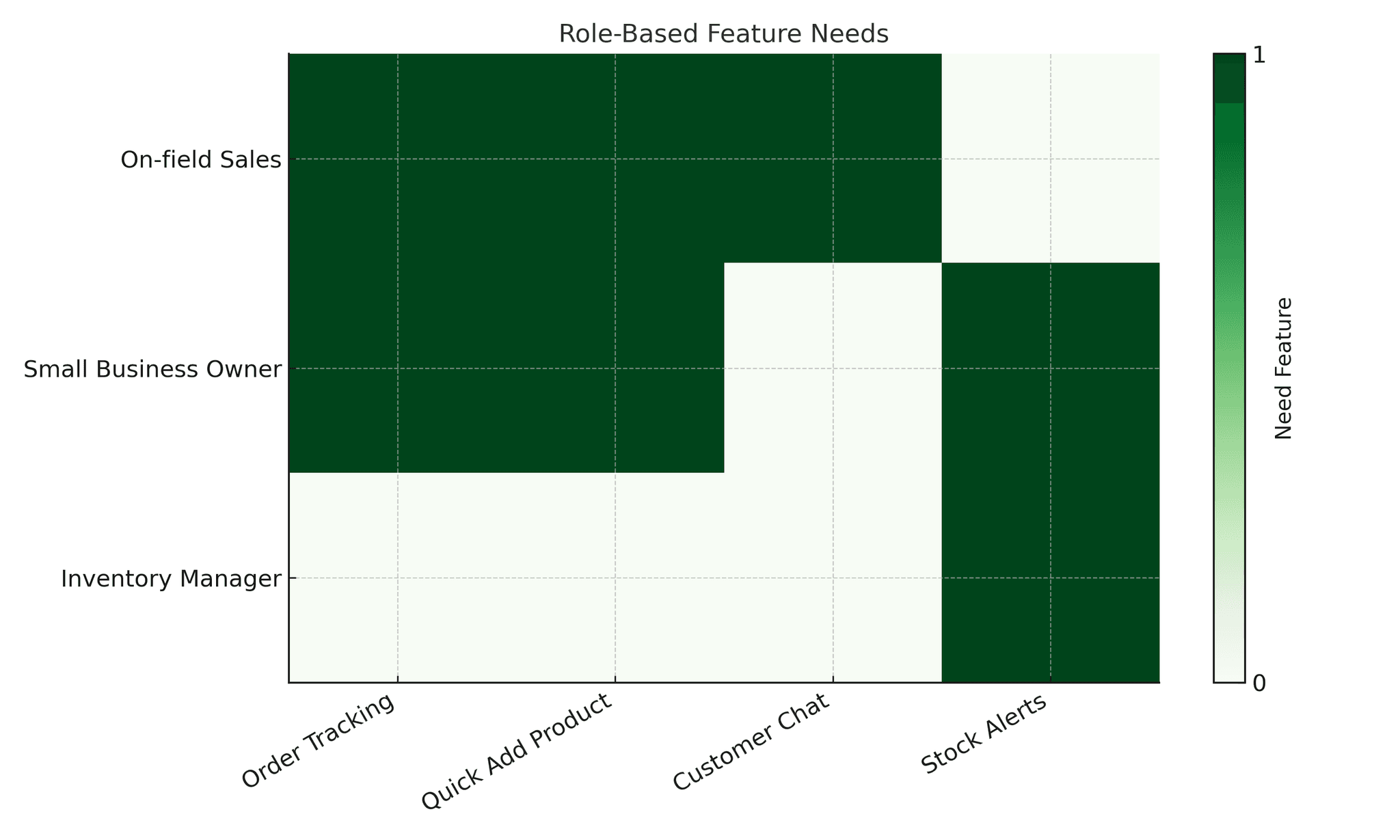
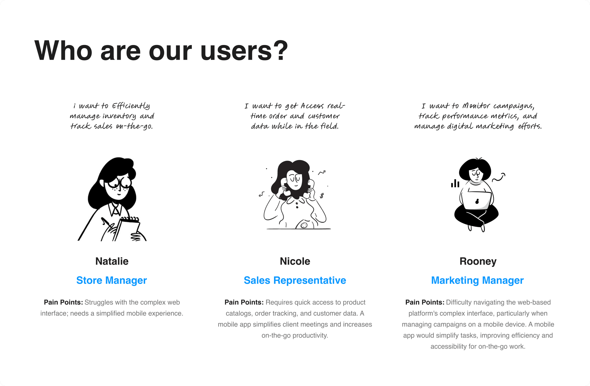
Understanding User Roles:
This role-driven approach became the foundation of our product thinking. Every feature was scrutinized not only for usability but for contextual relevance ensuring that each user saw only what mattered most to them. from small-town entrepreneurs running single storefronts to large warehouse managers overseeing regional operations.
User flow and Edge cases
With a clear understanding of our users, we turned our attention to flow optimization. One of the major goals of this project was to make the platform accessible and actionable within minutes — even for first-time sellers. That meant reducing setup friction and eliminating unnecessary steps from the onboarding journey.
We designed guided paths for essential tasks like store creation, product uploads, and order management, always prioritizing clarity and speed.
The target was ambitious: let sellers go live in under 10 minutes. Through rapid prototyping and iteration, we reached a structure that was lightweight but still comprehensive.

The Solution
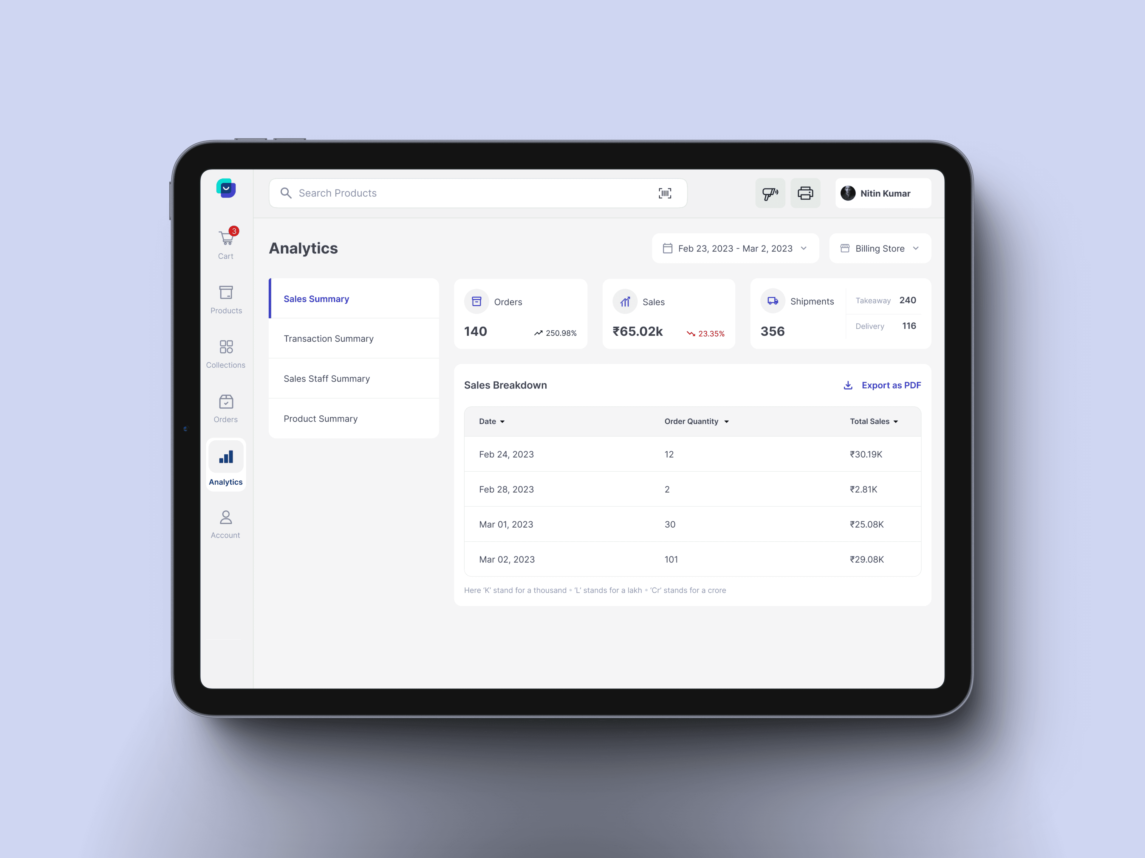
We redefined the mobile experience with a sharp focus on accessibility, speed, and clarity. Every screen was crafted to reduce cognitive load and every flow was distilled to its core function. The app became a lightweight but powerful tool — one that allowed businesses to set up shop, manage orders, and track performance, all from the palm of their hand.
Some of the most impactful solutions included:
Instant Onboarding
Sellers could now go live in under 10 minutes.
A guided setup helped even non-technical users create storefronts and upload products with ease.
Intelligent Automation Where It Matters Most
With a simplified dashboard and smart notifications, users could track orders, manage returns, and monitor stock without needing to be at a desk.
Role-Adapted Experiences
With a simplified dashboard and smart notifications, users could track orders, manage returns, and monitor stock without needing to be at a desk.
Mobile-Optimized Product Management:
Uploading, editing, and organizing products became frictionless through a lean UI, with batch editing and media support directly from the phone.
Integrated Payments and Storefront Controls
The platform included storefront customization, payment summaries, and account settings, giving sellers full control of their brand and transactions.
Key Learnings
This project pushed me to think beyond screens and truly understand the ecosystems users operate within. Here’s what stood out:
Modular thinking improves scalability
Designing the platform with reusable patterns and atomic components allowed faster iteration and easier scalability as new seller features were introduced.
Simplifying complexity drives adoption
Sellers had varying levels of digital literacy. Simplifying workflows like product uploads or order tracking directly increased platform engagement.
Cross-functional collaboration is critical
Tight feedback loops with engineering, support, and business teams helped resolve edge cases and align the product roadmap with real seller pain points.
Internal tools deserve great UX
Even though it's a B2B tool, investing in thoughtful design raised seller satisfaction and reduced support tickets—proving internal platforms benefit greatly from UX focus.